Sizing the Player
Sizing considerations
There are two important concepts to keep in mind when sizing the video and the player:
-
Aspect ratio – The media width and height properties, set in your curl statement when creating a player, define the intrinsic video dimensions, also known as the aspect ratio.
- Player size – The player width and height properties, set in the CSS or HTML code, control the size of the player. As you change the size of the player, it will use the intrinsic video dimensions to keep the controls positioned correctly.
Set aspect ratio
The video aspect ratio is the relation between width and height. Classic TVs use a 4:3 aspect ratio, while widescreen uses a 16:9 aspect ratio.
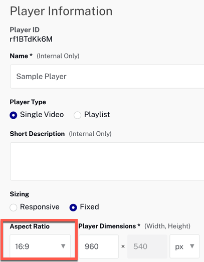
When you create a player, you can specify the aspect ratio using Studio. Use the Players module, Information section.
The video aspect ratio will remain the same and the player controls will be positioned correctly as the player responsively resizes.
Using an incorrect ratio
When you specify a media aspect ratio that is different than the dimensions of your video, you will get letter boxing around the video and the player controls will not be positioned over the video.
Here we set the media width and height to 640px and 480px respectively (4:3 aspect ratio), while using the Tiger video which has a 16:9 aspect ratio.

Using the correct ratio
When the media dimensions match the aspect ratio of your video, then there is no letter boxing and the player controls stay positioned correctly as you resize the player.
Here we set the media width and height to 640px and 360px respectively (16:9 aspect ratio) which is the same as the Tiger video.

Set player size
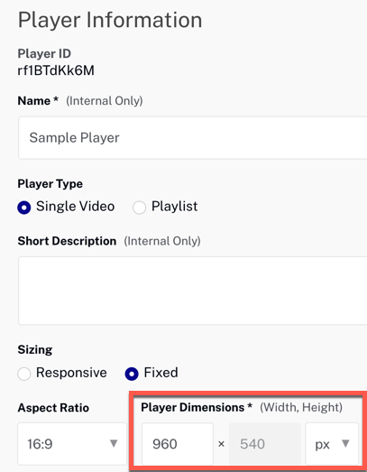
You can set the size of the player using Studio. Use the Players module, Information section. To set a fixed player size, select Fixed sizing and enter the Player Width; the Player Height is calculated from the aspect ratio.
You can also use CSS to size the player, as detailed in the following sections.
Use Iframe
For the Iframe implementation, the player size can be set by supplying the width and height attributes for the iframe element. There are several ways to do this:
-
Add attributes to the
iframeelement -
Use CSS with the
iframeelement -
Use CSS with an
idattribute
Add attributes to the iframe element
Add and set the width and height attributes to the iframe element.
<!doctype html>
<html>

<head>
  <meta charset="UTF-8">
  <title>Size the Player</title>
</head>

<body>

  <iframe src="https://players.brightcove.net/1507807800001/rf1BTdKk6M_default/index.html?videoId=6116766236001"
    allowfullscreen=""
    allow="encrypted-media"
    width="960" height="540"></iframe>

</body>
</html>
Use CSS with the iframe element
In CSS, set the width and height attributes for the iframe element.
<!-- Page styles -->
<style>
  iframe {
      width: 640px;
      height: 360px;
   }
</style>
Use CSS with an id attribute
In CSS, reference an id added to the iframe element. This approach is useful if you have more than one iframe element on the page.
<!-- Page styles -->
<style>
  #myPlayer {
    width: 640px;
    height: 360px;
  }
</style>
...
<iframe id="myPlayer" ...
Use JavaScript (in-page embed)
For the JavaScript (in-page embed) implementation, the player size can be set by supplying the width and height attributes for the video element. There are several ways to do this:
- Add attributes to the
videoelement - Use CSS with the class attribute
- Use CSS with an
idattribute
Add attributes to the video element
Add and set the width and height attributes to the video element.
<video-js data-account="1507807800001"
  data-player="rf1BTdKk6M"
  data-embed="default"
  controls=""
  data-video-id="6116766236001"
  data-playlist-id=""
  data-application-id=""
  width="960" height="540"></video-js>
<script src="https://players.brightcove.net/1507807800001/rf1BTdKk6M_default/index.min.js"></script>
Use CSS with the class attribute
The video element has a class attribute which can be referenced from CSS to set the player size.
<!-- Page styles -->
<style>
  .video-js {
    width: 640px;
    height: 360px;
  }
 </style>
Use CSS with an id attribute
In CSS, reference an id added to the video element. This approach is useful if you have more than one video element on the page.
<!-- Page styles -->
<style>
  #video_1 {
    width: 640px;
     height: 360px;
  }
</style>
...
<video-js id="video_1" ...
Using percentages
When using the height and/or width attributes on Brightcove Player's Iframe or video tags, those attributes are measured in pixels only. In fact, you do not enter any units at all for the height and width attributes (you can enter the px, but technically it is invalid HTML):
width="480"
You can use percentages, and this can be accomplished using CSS in two different ways:
- Using a
styleattribute in thevideotag.<video-js data-video-id="5622718636001" data-account="1507807800001" data-player="default" data-embed="default" data-application-id controls="" style="width: 100%;height: 100%"></video-js> <script src="https://players.brightcove.net/1507807800001/default_default/index.min.js"></script> - Using a
styletag.... <style> .video-js { height: 100%; width: 100%; } </style> ... <video-js data-account="1752604059001" data-player="H1xW7NWcz" data-embed="default" data-application-id controls=""></video-js> <script src="https://players.brightcove.net/1752604059001/H1xW7NWcz_default/index.min.js"></script>
Fullscreen display
In newer browsers that support the fullscreen API, it's necessary to apply in-page CSS rules to ensure the player is scaled to 100% when switching to fullscreen. Otherwise, the player will appear at the original size within the fullscreen display.
Use the following CSS to ensure the player scales when in fullscreen mode:
/***************************
* Fullscreen display      *
***************************/
body.vjs-full-window {
  padding: 0;
  margin: 0;
  height: 100%;
}
.video-js.vjs-fullscreen {
  position: fixed;
  overflow: hidden;
  z-index: 1000;
  left: 0;
  top: 0;
  bottom: 0;
  right: 0;
  width: 100% !important;
  height: 100% !important;
}
.video-js:-webkit-full-screen {
  width: 100% !important;
  height: 100% !important;
}
.video-js.vjs-fullscreen.vjs-user-inactive {
  cursor: none;
}
Order of precedence
You have seen a number of ways to size the player. The following is a list in order precedence:
- Runtime changes (use JavaScript to change player size)
- Size set in the <video-js> tag
- CSS (following normal rules of inheritance)
- Player configuration settings
Size in the Player API
There are 4 player methods in the Player API that return sizes in pixels, but it is important to understand the difference between them.
.height()- returns the height set in theheightattribute of thevideotag (if that attribute is not set,height()will return 0).width()- returns the width set in thewidthattribute of thevideotag (if that attribute is not set,width()will return 0).currentHeight()- returns the current height of the player, however it was set.currentWidth()- returns the current width of the player, however it was set
In most cases, currentHeight() and currentWidth() are the methods you want to use.