Overview: Components
Components labeled
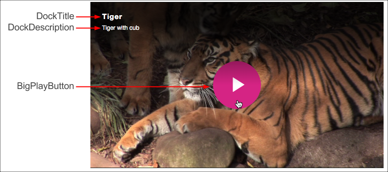
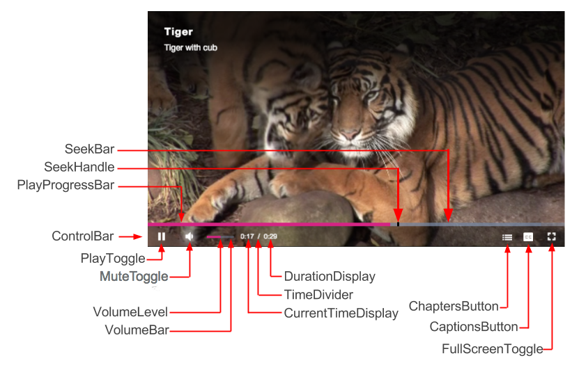
Following are screenshots of the player, on player load and when playing back a video, with the components labeled.
On player load and hover
During playback
For information on CSS selectors for these components see the Customize Player Appearance document's Component selectors section.
Hierarchical structure
The default, hierarchical component structure of the player is as shown:
Player
  Player
      PosterImage
      TextTrackDisplay
      DockText
        DockTitle
        DockDescription
      DockShelf
      LoadingSpinner
      BigPlayButton
      ControlBar
        PlayToggle
        VolumePanelHorizontal
          MuteToggle
          VolumeControl
            VolumeBar
              VolumeLevel
        CurrentTimeDisplay
        TimeDivider
        DurationDisplay
        ProgressControl
          ProgressHolder
          SeekBar
          LoadProgressBar
          PlayProgressBar
          SeekHandle
        LiveControl
        RemainingTimeDisplay
        Spacer
        PlaybackRate
        ChaptersButton
        DescriptionsButton
        SubtitlesCaptionsButton
        AudioTrackButton
        FullscreenToggle
      ErrorDisplayModal
      ModalDialog
      InfoModal
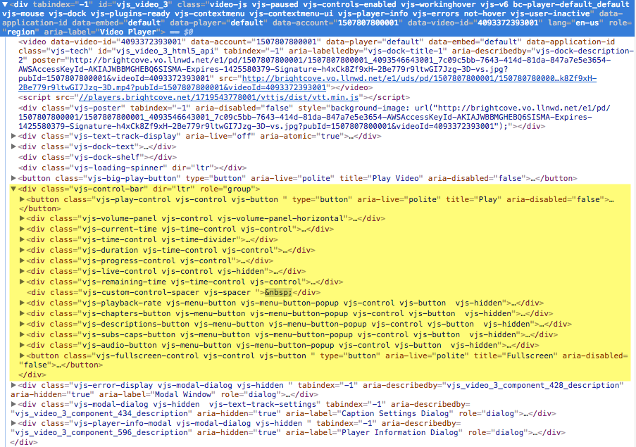
You can also see the structure of the components by view the Elements tab of a browser's Dev Tools. You see the elements in the screenshot below. For example, highlighted in yellow are the ControlBar's child elements.
Definitions
Definitions for key components are given in the following table:
| Component | Description |
|---|---|
| PosterImage | The image displayed until the video starts playing |
| TextTrackDisplay | Text that is displayed as a separate track used for captions and subtitles (in WebVTT format) |
| LoadingSpinner | The animated spin wheel that displays until the video is loaded |
| BigPlayButton | The play button displayed within the area of button at load time |
| ControlBar | The container for all the main player controls |
| PlayToggle | The play button that toggles between play and pause |
| MuteToggle | The button to toggle between audio muted and not |
| VolumeControl | Slider bar to control the volume level |
| VolumeLevel | Displays the current volume level when hovering over the volume bar |
| VolumeHandle | Shows the current position of the volume level and can be dragged to adjust the volume level |
| CurrentTimeDisplay | Current duration of played video displayed as mm:ss |
| TimeDivider | The forward slash '/' separating the current duration and the duration of the video |
| DurationDisplay | The overall duration of the video |
| ProgressControl | The component that contains the seek, load progress and play progress bars |
| SeekBar | Media bar which becomes active upon receiving the event that media has been fetched |
| LoadProgressBar | Indicates the progression of the video being fetched |
| PlayProgressBar | Indicates the progression of the video being played |
| SeekHandle | Shows the current position of the playhead during playback and can be dragged to adjust the playhead |
| LiveControl | Displays the word LIVE if streaming a live feed |
| RemainingTimeDisplay | Displays the duration of the video yet to be played |
| Spacer | Element inserted into the ControlBar especially for adding icons |
| PlaybackRate | Displays the playback rate |
| ChaptersButton | Button to display chapters |
| CaptionsButton | Toggle to display the caption settings form |
| FullScreenToggle | Button to toggle fullscreen display |
| CaptionsSettings | Form to display and alter caption settings |
| DockText | Container for the title and description |
| DockTitle | Title of the video |
| DockDescription | Short description of the video |
| DockShelf | Used by the social media plugin |
Class information
The player class, and all control classes, inherit from the Component class, or a subclass of Component.
videojs.Control = videojs.Component.extend();
videojs.Button = videojs.Control.extend();
videojs.PlayToggle = videojs.Button.extend();
The UI component architecture makes it easier to add child components to a parent component and build up an entire user interface, like the controls for the Video.js player. When you add a child component, it inserts the element of that child into the element of the parent and allows you to manipulate the element as needed, as shown here:
myButton = myPlayer.controlBar.addChild('Button');
myButton.addClass('bc-download-button');
myButton.on('click',function(){
  ...
})