Customizing Player Appearance
Create own skin
If you wish to not use the default skin and create your own, this is possible using the Player Management API. The Player Configuration Guide provides the necessary information.
Player
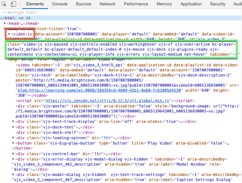
You can alter the appearance of the player, but you must first have a way to address it. To see this, browse an HTML page with the JavaScript (in-page embed) code inserted. In the Elements section of the Development Tools locate the <video-js> tag and you will see it has a class with the value video-js assigned, among many others.
Once you know this, you can use styles to alter the player itself. For instance, to include a border around the player you can use this style:
<style>
  .video-js {
    border-style: double;
    border-width: thick;
    border-color: red;
  }
</style>
iframe player
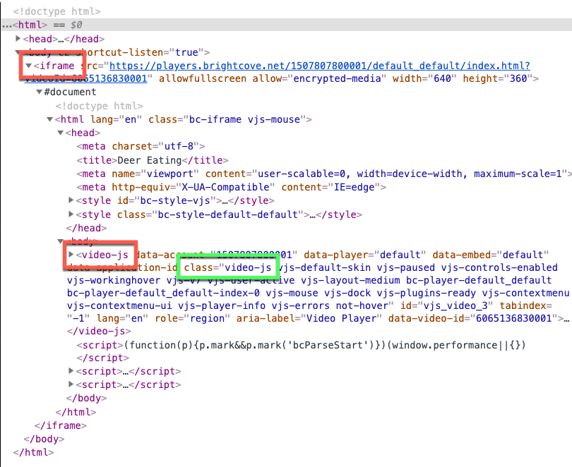
If you are using the Iframe implementation of the player the situation is different. You will still see the player with the video-js class, but it will be, of course, inside the iframe, and inside the video-js tag.
The styles you create will still work with the player in the iframe, but a CSS file will need to be created and associated with the player using Studio. You do this by going to the Players module, then click on the player with which you wish to associate the CSS, then in the Plugins > Stylesheets section add the path you your CSS file.
If you do wish to customize the iframe itself, you can do this by using an element selector. Then use a <style> tag to modify as wished. In the example below a border is added around the player.
<!doctype html>
<html>

<head>
  <meta charset="UTF-8">
  <title>Untitled Document</title>
  <style>
    .video-js {
      border-style: double;
      border-width: thick;
      border-color: red;
    }
  </style>
</head>

<body>

<iframe src="https://players.brightcove.net/1507807800001/default_default/index.html?videoId=6065136830001"
  allowfullscreen=""
  allow="encrypted-media"
  width="640" height="360"></iframe>

</body>

</html>
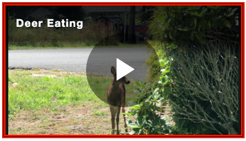
Play button
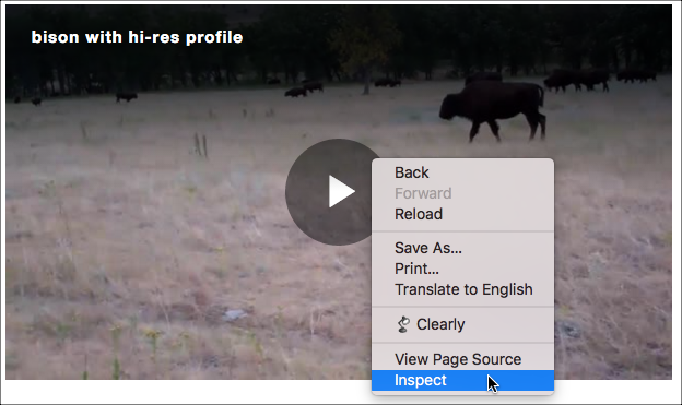
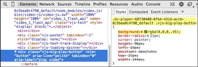
If you wish to alter the appearance of the play button you first need to know how to address it. In Chrome, right click on the button. From the selections that appear choose Inspect. When you select Inspect, Chrome's Development Tools will open.
In the Elements section of the Development Tools, you will see the HTML code that corresponds to the button element.
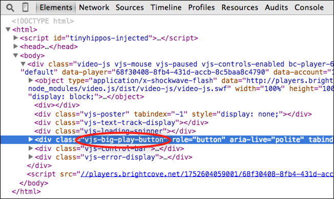
From the highlighted code above, you can see the class assigned to the button is vjs-big-play-button. The play button's color (to match the tiger) and opacity will be changed with these styles:
.vjs-big-play-button {
  background-color: #B37D5B;
  opacity: .6;
}
You would think that this approach would work, but it does not. When working with CSS you need to be aware of property specificity. This refers to how the browser determines which property values get applied to an element based on their relevance.
One way to apply the button changes is to add another class in the selector. For instance, you can use the .video-js class to increase the selector's specificity. For more details, see the CSS specificity section
Then, reference the player's big play button in the CSS as follows:
.video-js .vjs-big-play-button {
  background-color: #B37D5B;
  opacity: .6;
}
Here is the result of changing the button from dark grey to orange:
Hide play button
You can completely hide the play button by using the following style:
display: none;
Experiment
The following CodePen permits you to experiment with the play button. Note that the triangle in the play button is actually a font, and its size is controlled with a font-size style.
See the Pen Big Play Button Customization by Brightcove Learning Services (@rcrooks1969) on CodePen.
Change hover text
If you would like to change the text which displays when you hover over the big play button, which is Play Video by default, to something more specific to your videos, you can do that. Add the following JavaScript using your desired verbiage as the argument for the controlText method.
videojs.getPlayer('myPlayerID').ready(function() {
  var myPlayer = this;
  myPlayer.getChild('bigPlayButton').controlText('Play Audio');
});
Controls visibility
You can control if you want the controlbar, and controls contained therein, visible or not. If you wish to hide the controlbar from the start of player creation you can use this style:
.video-js .vjs-control-bar {
  display: none;
}
If you wish to do this dynamically based on some event, you can use the controlBar.hide()/show() methods. The code snippet below demonstrates the methods use (this assumes you have an id with a value of myPlayer on the video):
<video-js id="myPlayerID"
  data-account="1507807800001"
  data-player="default"
  data-embed="default"
  controls=""
  data-video-id="5781068653001"
  data-playlist-id=""
  data-application-id=""
  width="960" height="540"></video-js>
<script src="https://players.brightcove.net/1507807800001/default_default/index.min.js"></script>

<p><button onclick="hideBtn()">hide controls</button></p>
<p><button onclick="showBtn()">show controls</button></p>

<script>
  var myPlayer;
	videojs.getPlayer('myPlayerID').ready(function() {
		myPlayer = this;
	});

	function hideBtn() {
		myPlayer.controlBar.hide();
	}

	function showBtn() {
		myPlayer.controlBar.show();
	}
</script>
Controls never hide
You can also make it so the controls never hide. To do this use the transform.none style. The selector is very long as six classes are used for the specificity of transforms.
.video-js.not-hover.vjs-has-started.vjs-paused.vjs-user-active .vjs-control-bar:not(.vjs-focus-within):not(.vjs-control-bar-visible),
.video-js.not-hover.vjs-has-started.vjs-paused.vjs-user-inactive .vjs-control-bar:not(.vjs-focus-within):not(.vjs-control-bar-visible),
.video-js.not-hover.vjs-has-started.vjs-playing.vjs-user-active .vjs-control-bar:not(.vjs-focus-within):not(.vjs-control-bar-visible),
.video-js.not-hover.vjs-has-started.vjs-playing.vjs-user-inactive .vjs-control-bar:not(.vjs-focus-within):not(.vjs-control-bar-visible),
.video-js.vjs-has-started.vjs-paused.vjs-ad-playing.vjs-user-inactive .vjs-control-bar,
.video-js.vjs-has-started.vjs-playing.vjs-user-inactive .vjs-control-bar:not(.vjs-focus-within):not(.vjs-control-bar-visible){
  transform: none;
  -webkit-transform: none;
  -ms-transform: none;
}
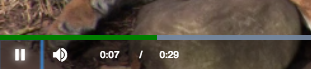
Progress bar
Now you will see how to change the color of the progress indicator. The default color for indicator is fuchsia, as shown here:
The challenge here is to find the class names for the elements. Using the same technique as described earlier in the document, right-clicking on an element and choosing Inspect, then drilling down you will see the vjs-play-progress class.
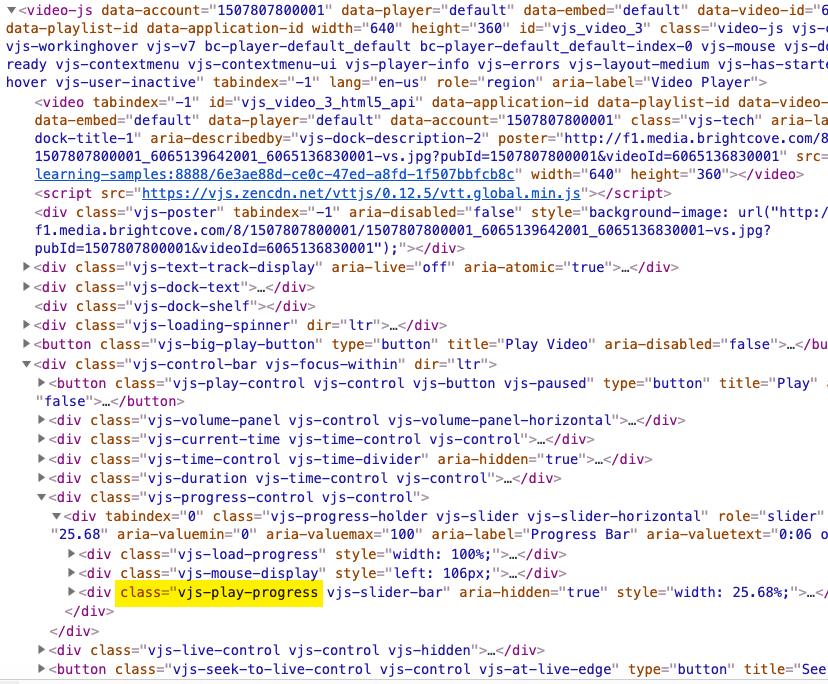
The background-color changes the color of the element and needs to be styled. The needed style is shown here:
.video-js .vjs-play-progress {
  background-color: green;
}
Notice that the .video-js class was added into the selector. This is done to increase the selector's CSS specificity.
The results appear as follows, showing a now green progress bar:
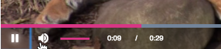
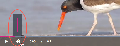
Volume controls
You can customize the volume control by using CSS or by passing in the options object during player creation.
Update using CSS
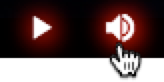
Now you will see how to change the color of the volume controls. The default look is shown here, a white volume button with a fuchsia volume level bar:
To change the color of the volume button, and the mute button when you click it, use the selector shown here:
.vjs-volume-panel.vjs-control.vjs-volume-panel-horizontal {
  color: yellow;
}
To change the color of the volume bar, the background-color of the element needs to be styled. The needed style is shown here:
.video-js .vjs-volume-level{
  background-color: yellow;
}
Notice that the .video-js class was added into the selector. This is done to increase the selector's CSS specificity.
The results of styling the button and volume bar are shown here:
Update using options object
To change the layout of the volume control, you can pass the options object into the bc() method as follows:
- Delay player creation by removing the following attributes from the
videotag:data-accountdata-playerdata-video-id
- Define the
optionsobject so that thevolumePanelis vertical and not inline with the controlbar.var options = { controlBar: { volumePanel: { inline: false, vertical: true } } }; - Add the player attributes that were initially removed.
- Create the player by calling the bc() method with the
optionsobject.bc("myPlayerID", options); - For details, see the Vertical Volume Control player sample.
Fonts
The title and description appear when the player is first loaded, and when the user hovers over the player. You can change the style for the fonts for the title and description, either together or separately. The HTML for the TitleBar appears as shown in the following screenshot. Note that there is a <div> element with a class of vjs-title-bar that contains two other <div> elements that contain the title and description.
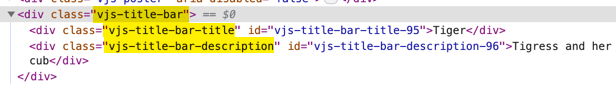
You can affect both the title and description by setting a style on the vjs-title-bar class. Note that styles set on the .vjs-title-bar-title and .vjs-title-bar-description will, of course, not be completely overridden by the style set at a higher level. Some styles are inherited, as shown by the following style:
.video-js .vjs-title-bar {
  color: yellow;
  font-size: .7em;
}
You can directly style the individual title and description. The following shows styles set on the .vjs-title-bar-title and .vjs-title-bar-description class selectors, with the resulting text displaying the styles:
.video-js .vjs-title-bar-title {
  color: red;
  font-size: 1.5em;
}
.video-js .vjs-title-bar-description {
  color: yellow;
  font-size: 1.0em;
}
Controlbar icon manipulation
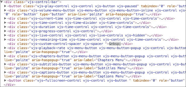
Controlbar icon order determined by the order of the HTML <div>s in the parent controlbar <div>. Here you see the controlbar <div> with all of its children.
Generally, this is the approach to take when placing in icon in the controlbar:
- Dynamically build the element you wish to insert into the controlbar.
- Get a reference to the controlbar element.
- Get a reference to the element you wish to insert your new element in front of in the controlbar.
- Use the JavaScript
insertBefore()method to place the icon.
Specifically, the following code is used to insert a download video icon in front of the volume icon:
- Lines 280-285: Style for the download button.
- Lines 291-295: Assign variables and create HTML elements for:
- The
<div>which will contain the icon for the download icon. - The anchor tag which make the icon clickable.
- The icon image itself.
- The
- Lines 297-2980: Assign and id and CSS classes to the new element.
- Line 300: Assign a source to the image.
- Line 301: Assign an
hrefto the link. - Line 302: Append the image to the link.
- Line 303: Append the link to the dynamically created
<div>. - Line 306: Get a reference to the controlbar to use with
insertBefore(). - Line 308: Get a reference to the element which the new icon will be insert in front of, to use with
insertBefore(). - Line 310: Insert the dynamically created element.
<!-- styles for page -->
  /* Style the download icon */
  #downloadButton {
      width: 34px;
      height: 33px;
      margin-top: 6px;
  }
</style>

<script type="text/javascript">
  videojs.getPlayer('myPlayerID').ready(function() {
    // Create variables and new div, anchor and image for download icon
    var myPlayer = this,
      controlBar,
      newElement = document.createElement('div'),
      newLink = document.createElement('a'),
      newImage = document.createElement('img');
    // Assign id and classes to div for icon
    newElement.id = 'downloadButton';
    newElement.className = 'downloadStyle vjs-control';
    // Assign properties to elements and assign to parents
    newImage.setAttribute('src','http://solutions.brightcove.com/bcls/brightcove-player/download-video/file-download.png');
    newLink.setAttribute('href','http://www.brightcove.com');
    newLink.appendChild(newImage);
    newElement.appendChild(newLink);
    // Get controlbar and insert before elements
    // Remember that getElementsByClassName() returns an array
    controlBar = document.getElementsByClassName('vjs-control-bar')[0];
    // Change the class name here to move the icon in the controlBar
    insertBeforeNode = document.getElementsByClassName('vjs-volume-menu-button')[0];
    // Insert the icon div in proper location
    controlBar.insertBefore(newElement,insertBeforeNode);
  });
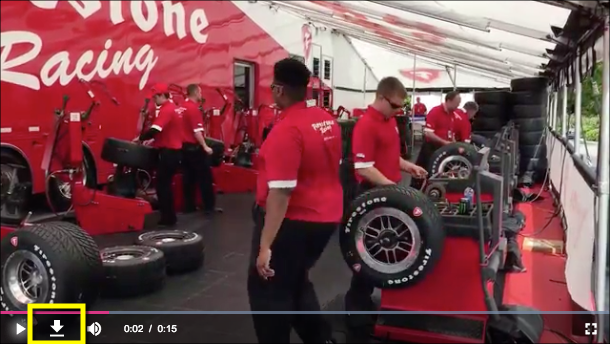
Here you see the result of the code, with the newly inserted icon highlighted in yellow:
If you wish to have the icon in a different location, you need only to change the code which gets the element to insert in front of. For instance, to move the new icon in front of the fullscreen button, use this:
insertBeforeNode = document.getElementsByClassName('vjs-fullscreen-control')[0];
The result would appear as follows:
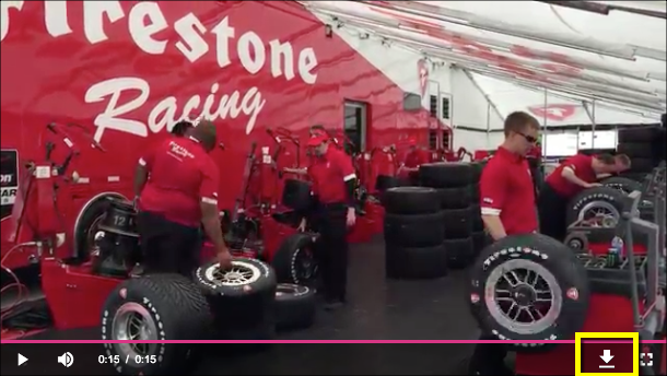
Icon on far right
If you wish the icon to appear at the far right of the controlbar, you would replace the insertBefore() with the appendChild() method, as shown here:
controlBar.appendChild(newElement);
An example of adding an icon (for downloading a file in this case) is shown in the Brightcove Player Sample: Download Video Plugin document.
Use the spacer
Although the techniques above work for placing icons on the controlbar, it is possible they will not be compatible with other code that manipulates the controlbar. Also, you most likely would not want to abstract the code into a plugin for general reuse.
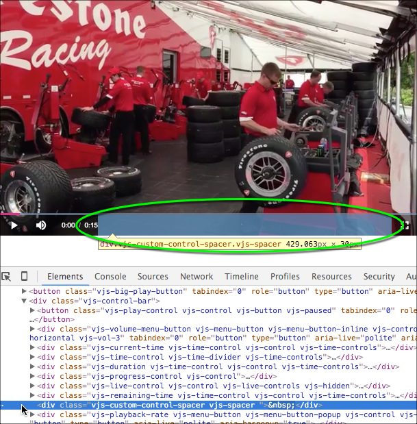
Weaknesses in the previous paragraph can be overcome by using the special spacer element inserted into the controlbar especially for adding icons. The drawback of the spacer is you do not have full control over where the icon can be placed, whereas you do using the techniques shown earlier in this section.
The spacer element is located in the controlbar between the time information on the left and the fullscreen icon on the right, as shown in the following screenshot (highlighted in the green oval). Note in the Elements section of the Dev Tools the element is defined an HTML <div>.
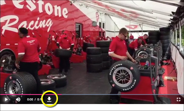
To place an icon in the spacer element, you use the following code, which is very similar to the code shown earlier in this section. The result of the code is shown in the screenshot which follows the code snippet.
// Get the spacer element
spacer = document.getElementsByClassName('vjs-spacer')[0];
// Place the new element in the spacer
spacer.appendChild(newElement);
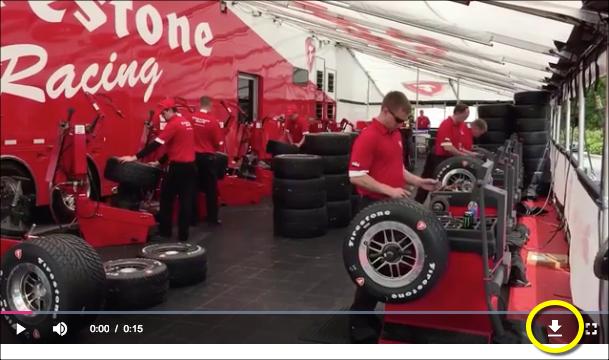
If you wish to place the icon on the right side of the spacer, another line of code needs to be used. The spacer layout is controlled by an HTML Flexbox. So adding a Flexbox style you can push the added icon to the right. The result of the code is shown in the screenshot which follows the code snippet.
// Set the content of the spacer to be right justified
spacer.setAttribute("style", "justify-content: flex-end;");
Remove fullscreen button
There can be issues if you permit fullscreen viewing of videos on iOS, detailed in the iOS and Brightcove Player document. If you wish to remove the fullscreen button from the controlbar you can so using this code:
<script type="text/javascript">
  videojs.getPlayer('myPlayerID').ready(function() {
    var myPlayer = this,
      fullScreenElement = document.getElementsByClassName("vjs-fullscreen-control")[0];
    if (videojs.browser.IS_IOS ) {
      fullScreenElement.parentNode.removeChild(fullScreenElement);
    }
  });
</script>
Note the if statement so the button is only removed on iOS devices.
Controlbar icon "glow"
You can change the text shadow (sometimes referred to as the "glow") of the icons in the controlbar. For instance, you may want to change the color or increase the glow to bring more focus on the icon. The following screenshot shows the text shadow in red.
The affect shown is done by changing the CSS text-shadow. The selector determines that the change will only occur with the icon has focus or hover states.
.video-js .vjs-control:hover:before, .video-js .vjs-control:focus:before {
  text-shadow: 0 0 1em #f00,0 0 1em #f00,0 0 1em #f00;
}
For more information on the rather complex text-shadow style, see MDN's text-shadow document.
Hover gradient
When the player is first loaded, and when you mouse over the player, you see the video title displayed, as well as a black to transparent gradient over the top portion of the player. This section will show you how to alter the gradient.
The actual gradient is controlled by the CSS linear-gradient function in the vjs-title-bar HTML <div>. The size of the gradient can be controlled by the height of the vjs-title-bar HTML <div>. Here is an example structure of this element inside the player properties:
<div class="vjs-title-bar">
  <div class="vjs-title-bar-title">Tiger</div>
  <div class="vjs-title-bar-description"></div>
</div>
The default values for the gradient use the rgba() (red-green-blue-alpha) function, as shown here:
linear-gradient(180deg,rgba(0,0,0,.8) 25%,transparent 100%);
These values cause the gradient to horizontally fade from black, with an alpha of .8, to transparent. The value of 25% is a cut off value, meaning the value set in the rgba function will be used for the first 25% of the space before the fading to transparent begins.
For instructional purposes, as you would not use this gradient in production, the following style creates the gradient in the screenshot.
.video-js .vjs-title-bar {
  background: linear-gradient(45deg, rgba(0,0,255,.8) 35%, transparent);
  height: 80%;
}
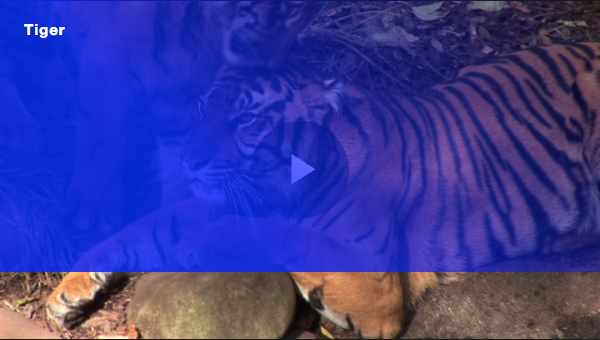
In this example, a blue gradient with a .8 alpha is applied at a 45 degree downhill angle. The color/alpha set in the linear gradient will be used for the first 35% of the gradient before it begins to fade. Also, 80% of the element height is used.
The following CodePen permits you to experiment with values. Start the video and mouse in and out to see the subtle gradient used by default.
See the Pen Hover Gradient Luna Skin by Brightcove Learning Services (@bcls) on CodePen.
Caption list items
If you wish to style/control the list items in the captions menu, the selectors are shown here:
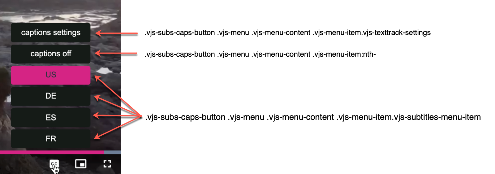
You can style all the items using the selector:
.vjs-subs-caps-button .vjs-menu .vjs-menu-content .vjs-menu-item.
CSS specificity
CSS specificity refers to the way browsers determine which property values get applied to an element based on their relevance. For details about this concept, review the Specificity article.
In Chrome, inspect the big play button. Notice that the background property is set using multiple classes. This means that we cannot use just the one .vjs-big-play-button class to override this property.
Here are three approaches to customize the big play button:
- Reference an id assigned to the player.
- Use multiple classes to raise the relevance of the properties.
- Use JavaScript to set the id attribute on the player and then reference it in the CSS.
Referencing an id
Since an id attribute has a high relevance regarding CSS specificity, adding an id to the CSS selector will override the background-color property.
If you haven't already done so, add an id attribute to the video element as follows:
<video-js id="video_1"
  data-account="1752604059001"
  data-player="default"
  data-embed="default"
  controls=""></video-js>
In the CSS, add the id value to the .vjs-big-play-button class selector. Override the background color and opacity as follows:
<style>
  #video_1 .vjs-big-play-button {
      background-color: #B37D5B;
      opacity: .6;
    }
    .video-js {
      width: 640px;
      height: 360px;
    }
</style>
You should see that the big play button is now orange.
Using multiple classes
Since the background property for the big play button is set using two classes, you will need at least two classes in the CSS selector to override this property.
Add the .video-js class to the .vjs-big-play-button class selector. Remember that the .video-js class is set on the video container.
With these values, we are saying select all elements with a class name of vjs-big-play-button which are decedents of elements with a class name of .video-js.
<style>
  .video-js .vjs-big-play-button {
    background-color: #B37D5B;
    opacity: .6;
  }
  .video-js {
    width: 640px;
    height: 360px;
  }
</style>
You should see that the big play button is now orange. Working with multiple classes can be tricky and may affect multiple elements, whereas an id is specific to one element.
Using JavaScript
You can also use JavaScript to dynamically add an id to the big play button. Then you can reference that id from the CSS.
Add code to add an id to the big play button element.
- Line 173: Gets a reference to the first element which has a class of
vjs-big-play-button. - Line 174: Adds an
idattribute to the big play button.
  <script type="text/JavaScript">

    var playButton = document.getElementsByClassName("vjs-big-play-button")[0];
    playButton.setAttribute("id", "myPlayButton");

  </script>
In the CSS, change the selector to use the myPlayButton id name.
<style>
    #myPlayButton {
      background-color: #B37D5B;
      opacity: .6;
    }
    .video-js {
      width: 640px;
      height: 360px;
    }
  </style>
You should see that the big play button is now orange.
Component selectors
These screenshots and following table show the components and the CSS selectors needed to manipulate that component. For more information on the components themselves see the Components Overview doc.
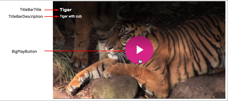
On player load and hover
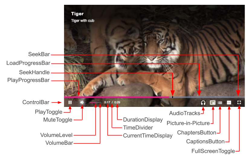
During playback
Summary of component selectors
| Component | Selector |
|---|---|
| BigPlayButton | .video-js.vjs-mouse .vjs-big-play-button |
| ControlBar | .video-js .vjs-control-bar (Inherited by icons in the ControlBar, but NOT the ProgressControl) |
| PlayToggle | .video-js .vjs-play-control |
| MuteToggle | .vjs-volume-panel.vjs-control.vjs-volume-panel-horizontal |
| VolumeBar | .vjs-volume-bar.vjs-slider-bar.vjs-slider.vjs-slider-horizontal |
| VolumeLevel | .video-js .vjs-volume-level |
| CurrentTimeDisplay | .video-js .vjs-current-time |
| TimeDivider | .video-js .vjs-time-divider |
| DurationDisplay | .video-js .vjs-duration |
| SeekBar | .video-js .vjs-progress-control.vjs-control |
| LoadProgressBar | .video-js .vjs-load-progress |
| PlayProgressBar | .video-js .vjs-play-progress.vjs-slider-bar |
| AudioTrack | .video-js .vjs-control-bar .vjs-audio-button |
| ChaptersButton | .video-js .vjs-chapters-button.vjs-menu-button |
| CaptionsButton | .video-js .vjs-captions-button.vjs-menu-button |
| QualitySelector | .vjs-quality-menu-wrapper.vjs-menu-button.vjs-menu-button-popup.vjs-control.vjs-button.vjs-quality-menu-button-use-resolution |
| FullScreenToggle | .video-js .vjs-fullscreen-control.vjs-control |
| TitleBarText | .vjs-title-bar (Inherited by both TitleBarTitle and TitleBarDescription) |
| TitleBarTitle | .vjs-title-bar-title |
| TitleBarDescription | .vjs-title-bar-description |
If the selector you are seeking is not in the table, please let us know by emailing the Knowledge Team and we will get it into the table.
{PLAYER_CLASS}
The {PLAYER_CLASS} is a selector and will be replaced with the actual class specific selector for the player, for example:
.bc-player-oH9IdGudo_default
{PLAYER_CLASS} helps you make your CSS specific enough to overwrite the built-in styles without having to make CSS for each player individually or use something like:
.video-js.video-js
For instance, say you want to override the loading spinner, you might use:
.video-js.video-js .vjs-loading-spinner {...}
That is specific enough to override the default, but if you happen to have a second player on the page. Using the following would NOT affect any other player in the page:
.video-js{PLAYER_CLASS} .vjs-loading-spinner {...}
Note that the {PLAYER_CLASS} selector can only be used in CSS files that are added to a player configuration stylesheets array (for example, via Studio or the Player Management API) and built directly into the player. This selector will not work with Advanced implementation code CSS separately included via <style></style> or <link></link> tags.