Introduction
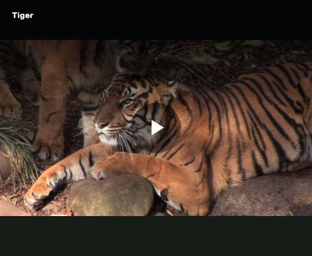
Responsive sizing means resizing player in response to changes in the size of the bounding window, while maintaining the aspect ratio, so that the video is not letterboxed (see image below).
When you embed a video player in a page, you will notice that it does not resize with the browser window. This occurs because, by default, the video player is given a fixed width and height, preventing it from responding to changes in the browser. One aspect of responsive web design is ensuring that elements within your page adapt gracefully to different screen sizes.
The player
Resize the browser to see how the video player resizes while maintaining the video aspect ratio. You should not see any letter-boxing around the video. Note that this document page has a maximum width for content.
How it works
The following sections explain the player and the HTML code used in the example.
Create a responsive player
While you can manually add HTML to your player embed code to create a responsive player, the easiest way is to use the Players module in Studio.
Follow these steps to create a responsive player:
- In the Players module, create a new player or use an existing one and click on the player name to edit its properties.
- Locate the Player Information section.
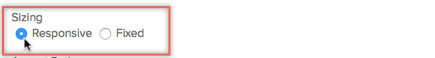
- Set the Sizing property to Responsive.
Responsive Size Settings -
Optional: You can add a width property in the Player Dimensions setting. With a responsive player, this sets a maximum width for the player.
- Click Save.
- To publish the player, click Publish & Embed > Publish Changes.
- To close the open dialog, click Close.
-
In the Media module, select a video and publish it with this player.Assign video content to the player and publish it.
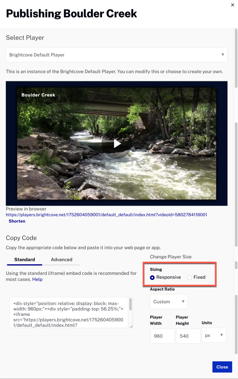
Media module publish - Copy either the Standard (iframe) or Advanced (In-Page) embed code and paste it into a new HTML file.
The player embed code
When you copy the Standard (iframe) embed code into your HTML page, notice that the player is wrapped in two
<div> containers. Your code should look similar to the following:
- Lines 1-9: Is the embed code that you copied when publishing a video with the player.
- Line 1: Defines an outer container that sets the maximum width for the player. The default is set to 100%. If you set a width in Studio, your player will be responsive up to the maximum width size.
- Line 2: Defines an inner container that uses an intrinsic ratio to set the height and maintain the correct aspect ratio. To learn more, see the Understand intrinsic ratio section.
- Lines 3-7: Contain the player code for the iframe implementation. Notice that line 3 has a
styleattribute which positions the player to fill its parent container. This allows the player to change size as the browser changes size.
<div style="position: relative; display: block; max-width: 960px;">
  <div style="padding-top: 56.25%;">
    <iframe src="https://players.brightcove.net/1752604059001/default_default/index.html?videoId=5802784116001"
      allowfullscreen=""
      allow="encrypted-media"
      style="position: absolute; top: 0px; right: 0px; bottom: 0px; left: 0px; width: 100%; height: 100%;">
    </iframe>
  </div>
</div>
iframe example
When you copy the Standard (iframe) embed code into your HTML page, your code should look similar to this:
<div style="position: relative; display: block; max-width: 960px;">
  <div style="padding-top: 56.25%;">
    <iframe src="https://players.brightcove.net/1752604059001/default_default/index.html?videoId=5802784116001"
      allowfullscreen=""
      allow="encrypted-media"
      style="position: absolute; top: 0px; right: 0px; bottom: 0px; left: 0px; width: 100%; height: 100%;">
    </iframe>
  </div>
</div>
In-Page embed example
When you copy the Advanced (In-Page) embed code into your HTML page, your code should look similar to this:
<!DOCTYPE html>
<html>
<meta charset="utf-8">

<head>
<title>Responsive Brightcove Player</title>

</head>

<body>

  <div style="max-width: 960px;">
    <video-js data-account="1752604059001"
      data-player="default"
      data-embed="default"
      controls=""
      data-video-id="5802784116001"
      data-playlist-id=""
      data-application-id=""
      class="vjs-fluid"></video-js>
  </div>
  <script src="https://players.brightcove.net/1752604059001/default_default/index.min.js"></script>

</body>
</html>
<!DOCTYPE html>
<html>
<meta charset="utf-8">

<head>
<title>Responsive Brightcove Player</title>

</head>

<body>
<div style="position: relative; display: block; max-width: 640px;">
<div style="padding-top: 56.25%;">
  <video-js
    data-account="1752604059001"
    data-player="VyqgG8mql"
    data-embed="default"
     data-application-id=""
     controls=""
    style="position: absolute; top: 0px; right: 0px; bottom: 0px; left: 0px; width: 100%; height: 100%;"></video-js>
  <script src="https://players.brightcove.net/1752604059001/VyqgG8mql_default/index.min.js"></script>
</div>
</div>

</body>
</html>
Understanding intrinsic ratio
In this solution, you used an intrinsic ratio, which is a CSS technique to fluidly constrain a child element to a
ratio set in their parent element. To do this, you added a <div> container
around the video player and set the padding-top property with the desired aspect
ratio for the video.
The padding property is the magic that styles a box with an intrinsic ratio. This is because the padding property is set as a percentage of the width of the containing block. It works well since padding styles are supported in all major browsers.
The aspect ratio is determined by a simple calculation to determine a percentage. For instance, calculate the percentage for a video with a 16:9 aspect ratio by dividing 9 by 16 (i.e. 9/16 = .5625) to get 56.25%. For a 16:9 video, you want the height to be 9/16ths of the width.
Using aspect-ratio
In this solution, you used the aspect ratio, a CSS property that sets a preferred aspect ratio for the box, used to calculate auto sizes and some other layout functions.
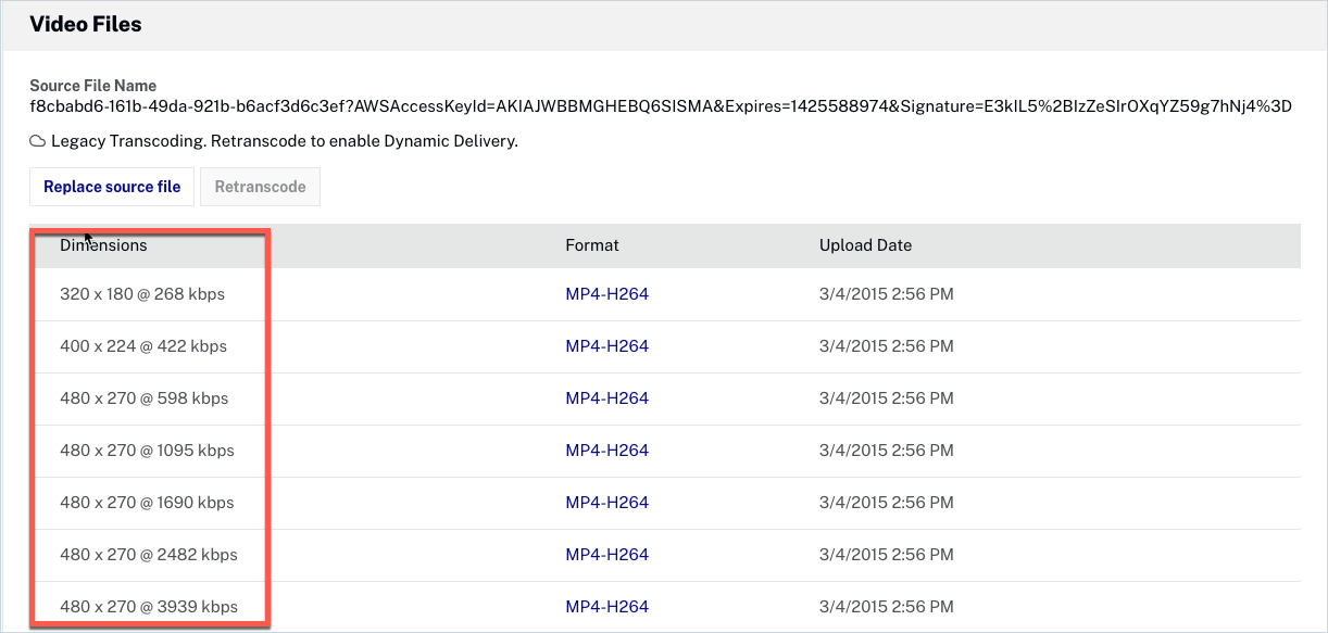
To calculate the aspect ratio, you divided the video width and height. These values are in the video files section under the dimensions inside the Media Module.
To do this, you add the aspect-ratio to the style property inside the <div> and divide the values corresponding to the width and height.
<div style="position: relative; display: block; max-width: 100%;">
  <div style="aspect-ratio: 480/270;">
    <iframe src="https://players.brightcove.net/1752604059001/default_default/index.html?videoId=5802784116001"
      allowfullscreen=""
      allow="encrypted-media"
      style="position: absolute; top: 0px; right: 0px; bottom: 0px; left: 0px; width: 100%; height: 100%;">
    </iframe>
  </div>
</div>
For the Advanced embed code, your code should look similar to this:
<div style="max-width: 960px; aspect-ratio: 480/270 !important;">
  <video-js data-account="1752604059001"
    data-player="default"
    data-embed="default"
    controls=""
    data-video-id="4093643993001"
    data-playlist-id=""
    data-application-id=""
    class="vjs-fluid"></video-js>
  <script src="https://players.brightcove.net/1752604059001/default_default/index.min.js"></script>
</div>
Using fluid mode
The Video.js library v5.0.0+ has been updated to support simple responsive classes. These classes are supported by the Brightcove Player when using the Advanced (In-Page) embed code.
The responsive classes include the following:
| Class | Default | Aspect ratio |
|---|---|---|
vjs-fluid |
Yes | 2.4:1 |
vjs-16-9 |
No | 16:9 |
vjs-4-3 |
No | 4:3 |
The fluid classes listed above apply the responsive sizing to the player. They accomplish this by applying a
padding-top attribute to the video element.
To create a responsive player which fills the browser, add one of the fluid classes to your player embed code. For example, to use a 16:9 aspect ratio, your code should look similar to this:
<video-js data-video-id="5802784116001"
  data-account="1752604059001"
  data-player="default"
  data-embed="default"
  data-application-id
  class="video-js vjs-16-9"
  controls></video-js>
<script src="https://players.brightcove.net/1752604059001/default_default/index.min.js"></script>
If you want to set a maximum size for your player, simply add a div container around
your embed code and set the max-width or max-height
attribute. For example, this code limits the size of the player to 640px:
<div style="max-width: 640px;">
  <video-js data-video-id="5802784116001"
    data-account="1752604059001"
    data-player="default"
    data-embed="default"
    data-application-id=""
    class="video-js vjs-16-9"
    controls=""></video-js>
  <script src="https://players.brightcove.net/1752604059001/default_default/index.min.js"></script>
</div>