Copied Code Details
Introduction
When you publish a video in a player you must choose either iframe or JavaScript code. The Choosing the Correct Code Type document discusses why one code type or the other is the correct choice for different situations. This document goes into detail of the code, no matter what is selected.
Which ever code type you choose, you have the option to then select Responsive or Fixed. The Responsive option directs the player to change appropriately based on screen size, platform and orientation.
For a complete list of attributes you can use with both code implementations see the following documents:JavaScript code
This is JavaScript code, very often used when you are going to programmatically customize your player.
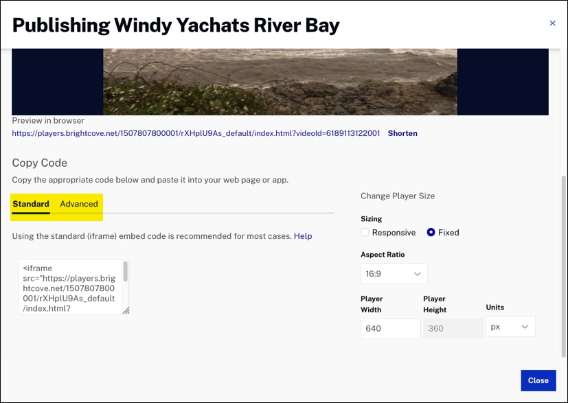
Fixed version
- Lines 1,11: The
divblock ... - Line 2: Uses the
<video-js>tag to define that Brightcove Player is used and also with which account the player is associated - Line 3: Player ID
- Line 4: Assign player parent/child relationships
- Line 5: Boolean value to determine if the controls should be visible in the player
- Line 6: ID of the video to load in a player
- Line 7: ID of the playlist to load in a playlist player
- Line 8: Allows re-use of a single player, but differentiates analytics on a per-site or per-application basis; see the Adding an Application ID to the Player Embed Code document for full details.
- Line 9: Set width and height
- Line 10: Applies the
vjs-fluidclass to the player and ends the<video-js>tag; see the Responsive Sizing for Brightcove Player - Using fluid mode - Line 12: The
<script>tag that is the JavaScript and CSS that makes up this instance of Brightcove Player.
<div style="width: 640px;">
  <video-js data-account="1507807800001"
    data-player="rXHplU9As"
    data-embed="default"
    controls=""
    data-video-id="6189113122001"
    data-playlist-id=""
    data-application-id=""
    width="640" height="360"
    class="vjs-fluid"></video-js>
</div>
<script src="https://players.brightcove.net/1507807800001/rXHplU9As_default/index.min.js"></script>
Responsive
- Line 1,16: Sets max-width of the player
- Line 2-6: CSS that enables responsive sizing; see Responsive Sizing for Brightcove Player for full details; note percentage changes based on aspect ratio
- Line 8: Uses the
<video-js>tag to define that Brightcove Player is used and also with which account the player is associated - Line 9: Player ID
- Line 10: Assign player parent/child relationships
- Line 11: Boolean value to determine if the controls should be visible in the player
- Line 12: ID of the video to load in a player
- Line 13: ID of the playlist to load in a playlist player
- Line 14: Allows re-use of a single player, but differentiates analytics on a per-site or per-application basis; see the Adding an Application ID to the Player Embed Code document for full details.
- Line 15: Applies the
vjs-fluidclass to the player and ends the<video-js>tag; see the Responsive Sizing for Brightcove Player - Using fluid mode - Line 17: The
<script>tag that is the JavaScript and CSS that makes up this instance of Brightcove Player.
<div style="max-width: 960px;">
  <style>
    video-js.video-js.vjs-fluid:not(.vjs-audio-only-mode) {
      padding-top: 56.25%;
    }
  </style>

  <video-js data-account="1507807800001"
    data-player="rXHplU9As"
    data-embed="default"
    controls=""
    data-video-id="6189113122001"
    data-playlist-id=""
    data-application-id=""
    class="vjs-fluid"></video-js>
</div>
<script src="https://players.brightcove.net/1507807800001/default_default/index.min.js"></script>
Standard code
This is standard code
Fixed
- Line 1:
<iframe>tag andsrcattribute that defines the player ID and the video ID for the player to load - Line 2: Allows the player to go fullscreen; on iOS fullscreen uses the native (Apple) player
- Line 3: Only required to play DRM assets in Chrome within an
<iframe> - Line 4: Sets width and height
- Line 5: Ends the
<iframe>tag
<iframe src="https://players.brightcove.net/1507807800001/default_default/index.html?videoId=6189113122001"
  allowfullscreen=""
  allow="encrypted-media"
  width="960" height="540">
</iframe>
Responsive
- Lines 1,9: Style in
<div>block for max width and responsive sizing support - Lines 2,8: Style in
<div>block; note percentage changes based on aspect ratio - Line 3:
<iframe>tag andsrcattribute that defines the player ID and the video ID for the player to load - Line 4: Allows the player to go fullscreen; on iOS fullscreen uses the native (Apple) player
- Line 5: Only required to play DRM assets in Chrome within an
<iframe> - Line 6: Style for responsive sizing support
- Line 7: Ends the
<iframe>tag
<div style="position: relative; display: block; max-width: 960px;">
  <div style="padding-top: 56.25%;">
    <iframe src="https://players.brightcove.net/1507807800001/default_default/index.html?videoId=6189113122001"
      allowfullscreen=""
      allow="encrypted-media"
      style="position: absolute; top: 0px; right: 0px; bottom: 0px; left: 0px; width: 100%; height: 100%;">
    </iframe>
  </div>
</div>